Gold as sensation
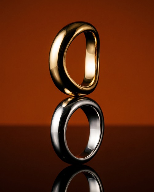
Mejuri's SS26 rings demanded a different kind of attention. Not the kind you look at, but the kind you feel. We built the entire visual direction around that instinct: warmth, proximity, and the specific weight of gold against skin.
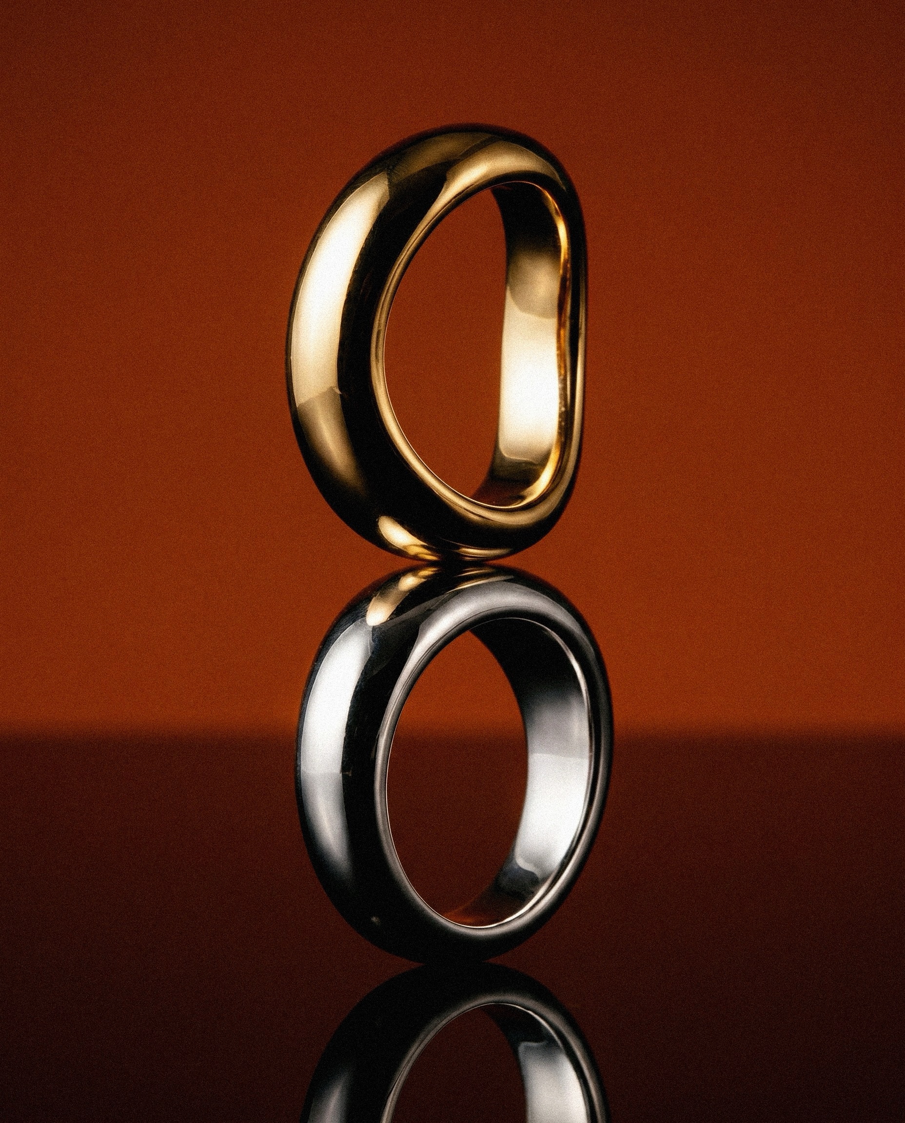
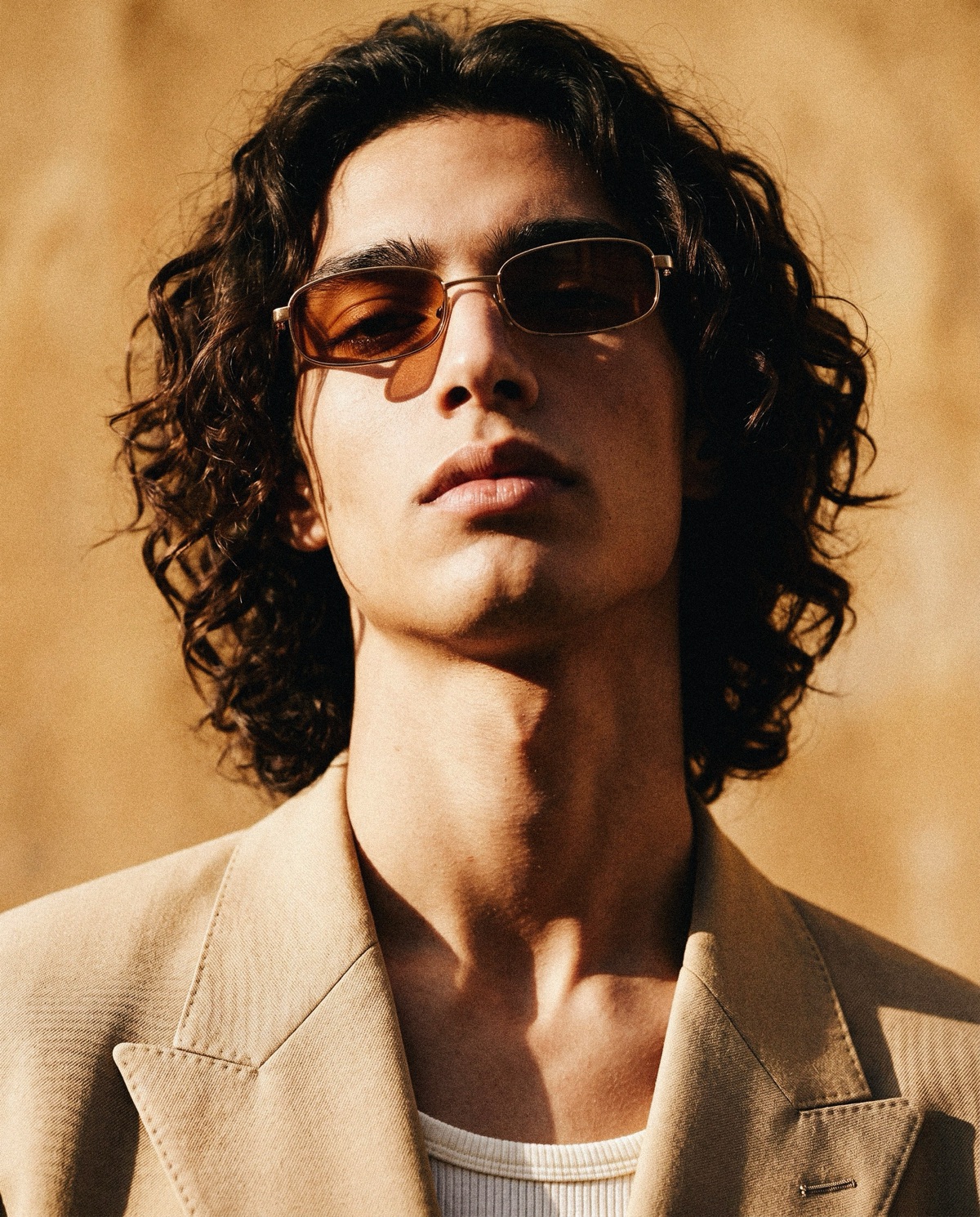
A single amber tone runs through every frame. It gives the gold somewhere to live, creating depth and heat that makes each piece feel immediate and physical rather than decorative.
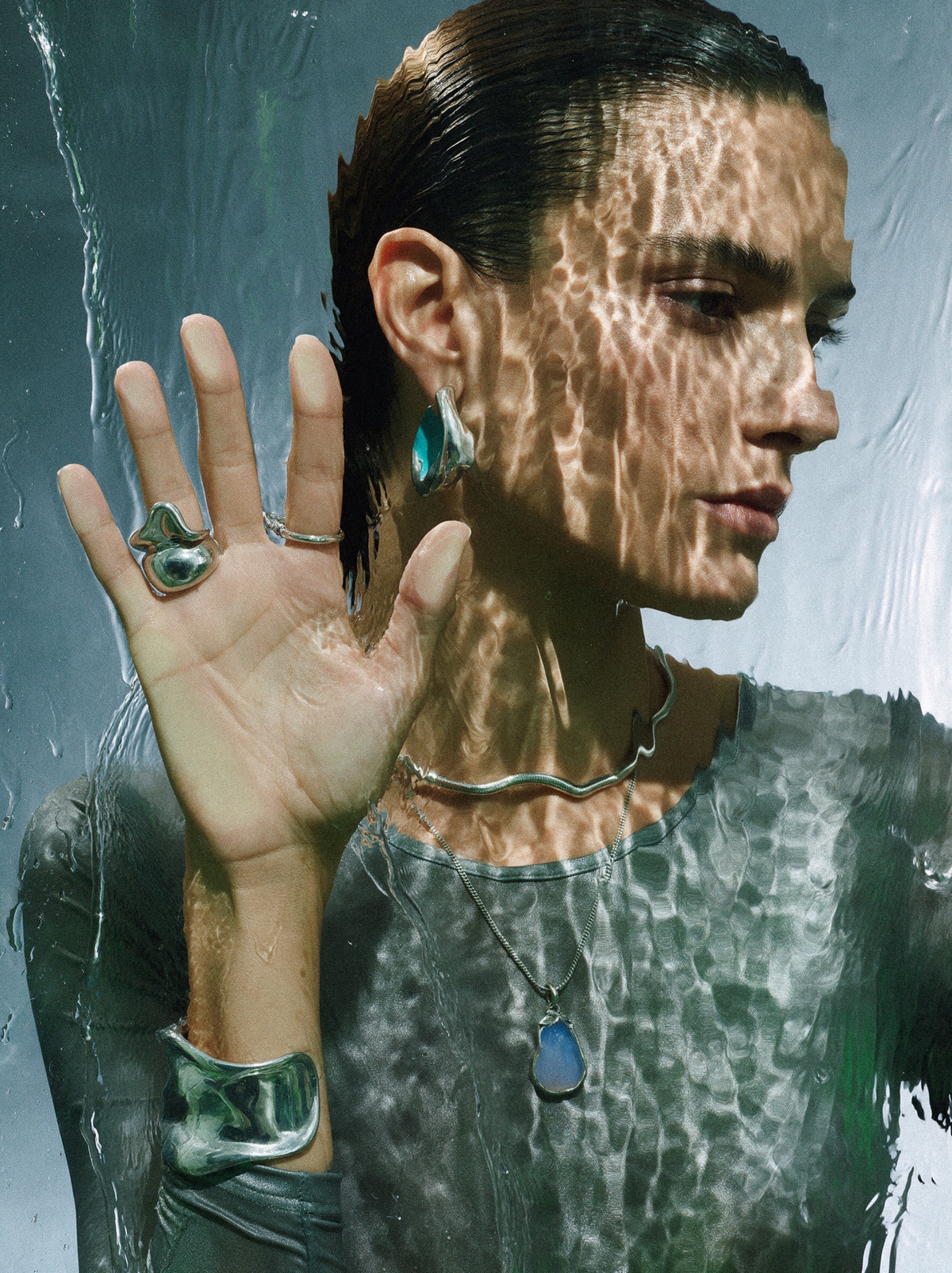
We shot the rings in two modes. Close and isolated, where form and material take over completely. And worn, where the relationship between object and body gives the pieces their weight and meaning. Both approaches were built from the same visual logic.
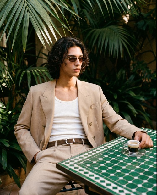
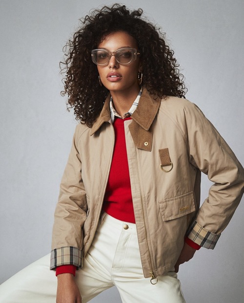
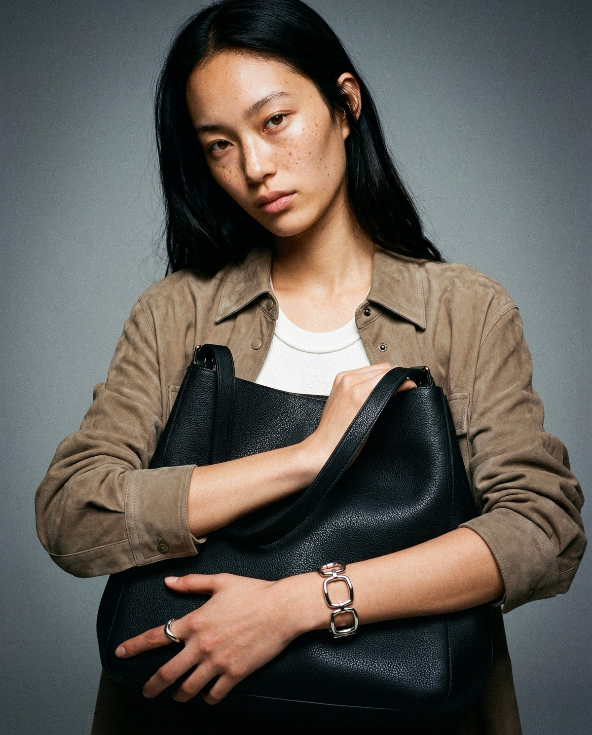
Casting was deliberate. The faces and hands chosen carry the jewellery with a quiet intensity that matches the tone of the collection. Nothing is performed. The pieces are simply present, and that presence is enough.
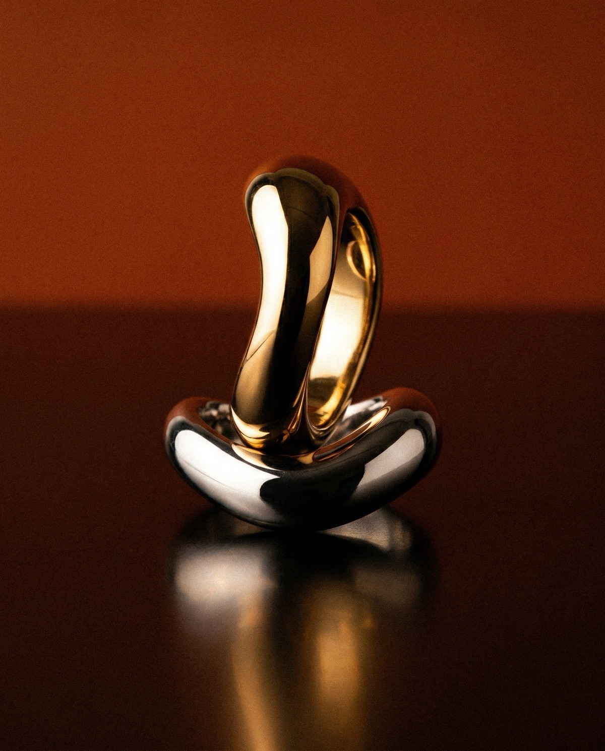

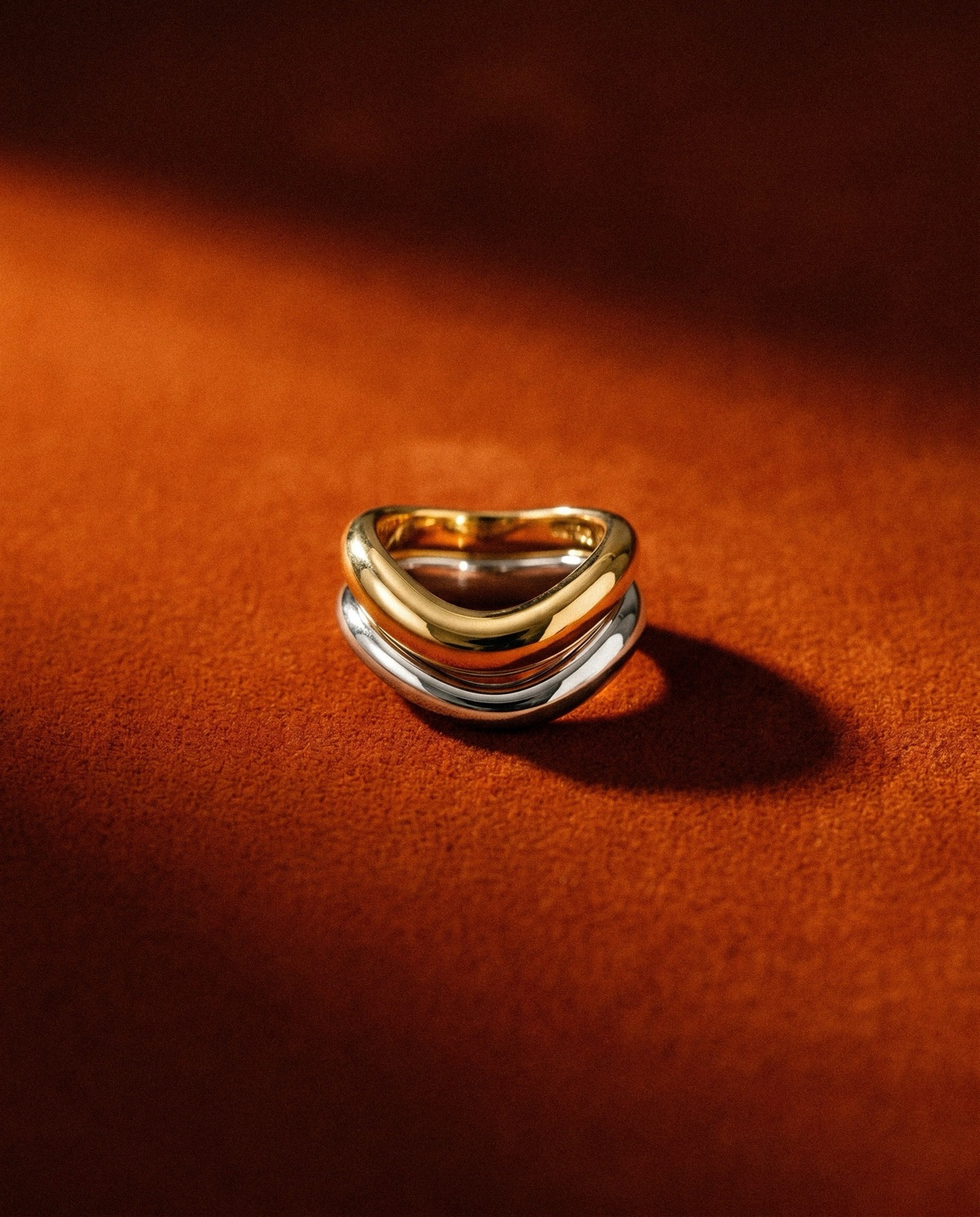
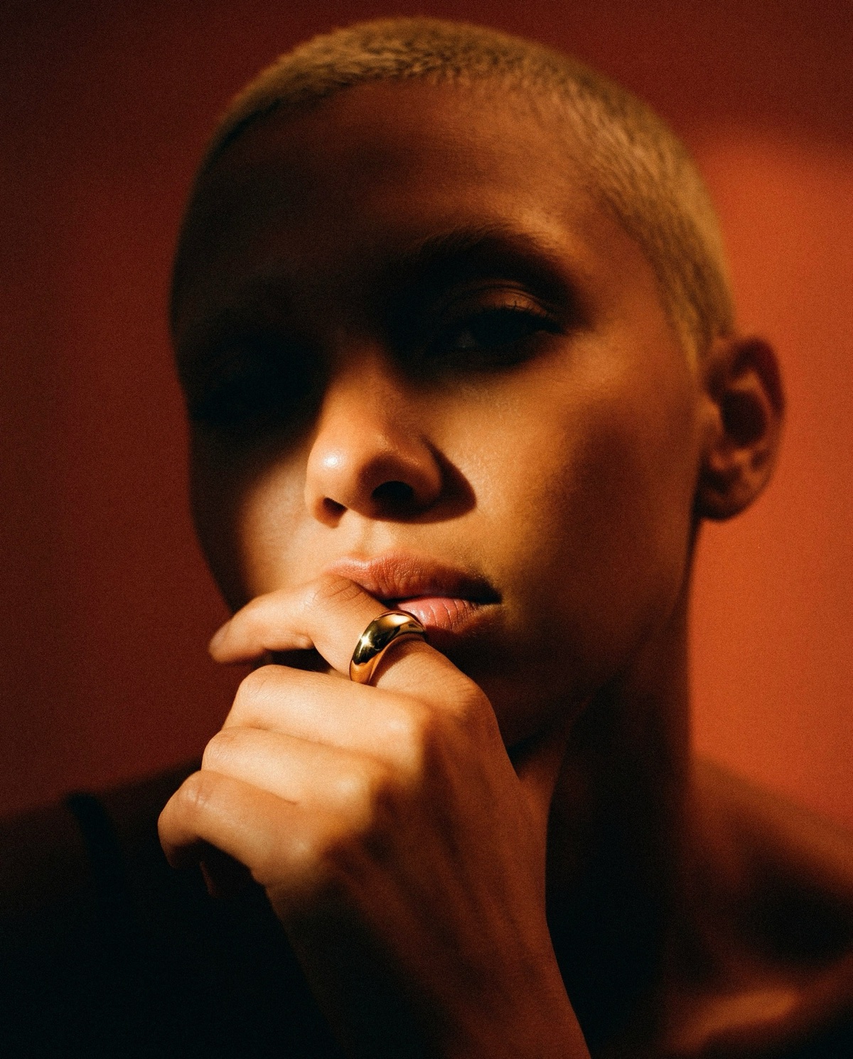
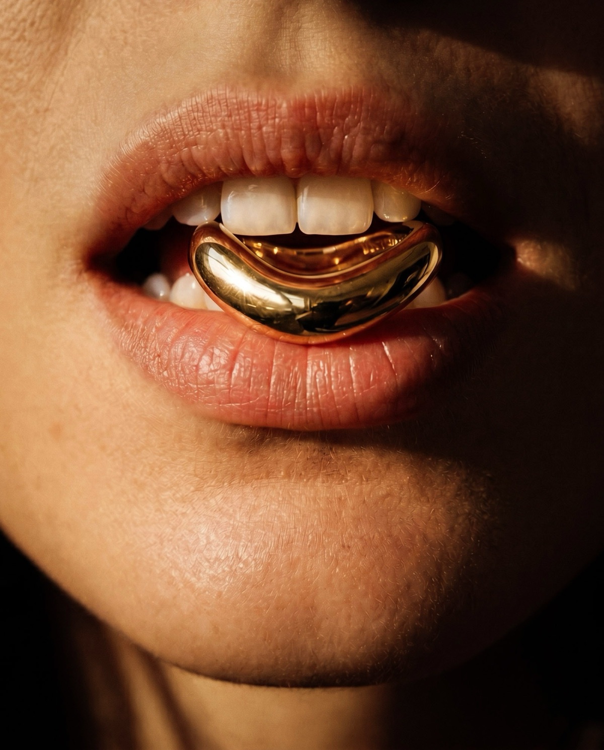
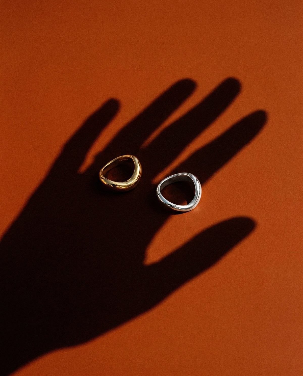
Warmth, shadow, and the weight of gold
The output is a campaign that works at every scale. Hero frames with enough tension to lead a full campaign, and close product shots with enough clarity to anchor an ecommerce page.
From one creative direction, a consistent body of work built around a single material and a single mood. The identity is immediate. That was the point from the start.






Ready to see what's possible?