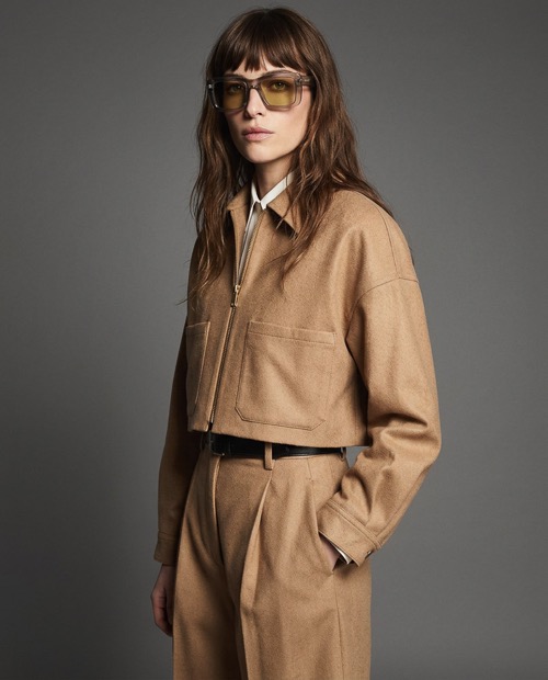
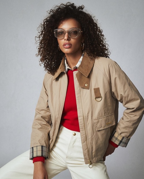
Object and presence
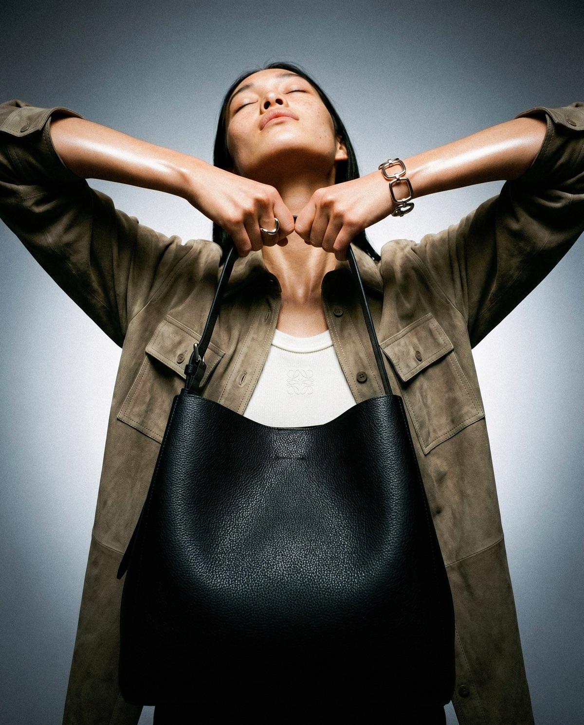
The brief was ours from the start: take a single accessory and build a visual language around it that holds across both product and campaign contexts. The Sac Large in black grain was the subject. The studio was the environment.
Every frame was built around the object itself. Controlled light, neutral surfaces, and deliberate casting kept the focus where it needed to be. The result is imagery that feels considered without feeling overly styled.
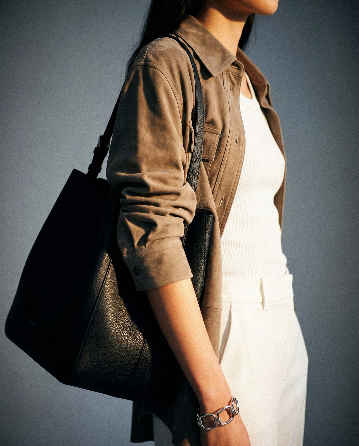
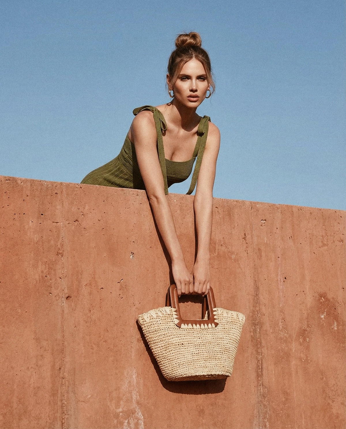
We treated the bag as the primary subject in every sense. Product shots were composed to show form and material clearly. Editorial frames introduced presence and scale through the model, without letting the styling compete with the piece itself.
The approach was minimal by design. A single bag, a single color, a single environment. Restraint was the creative choice, and it shows in how cohesive the output feels across every frame.
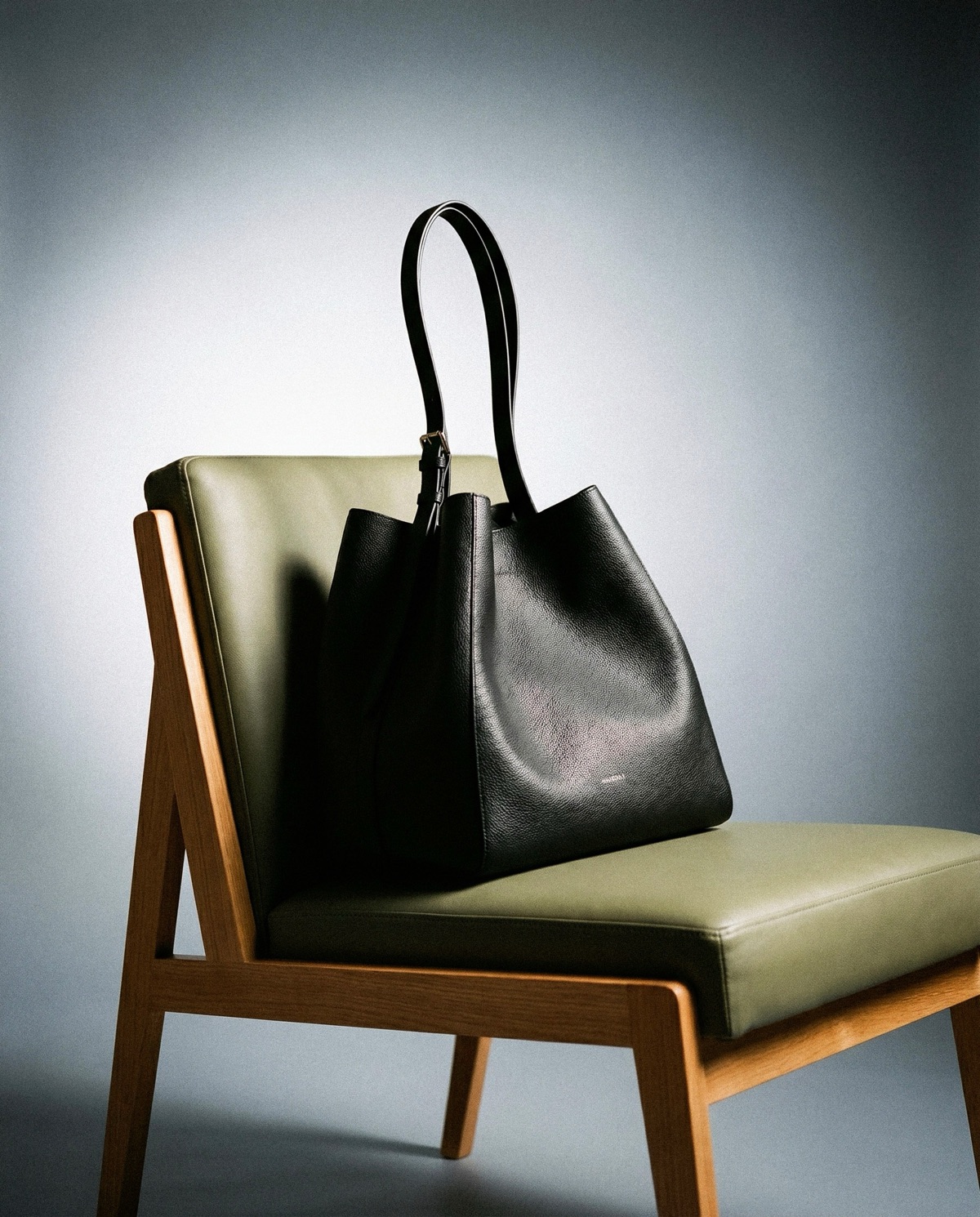
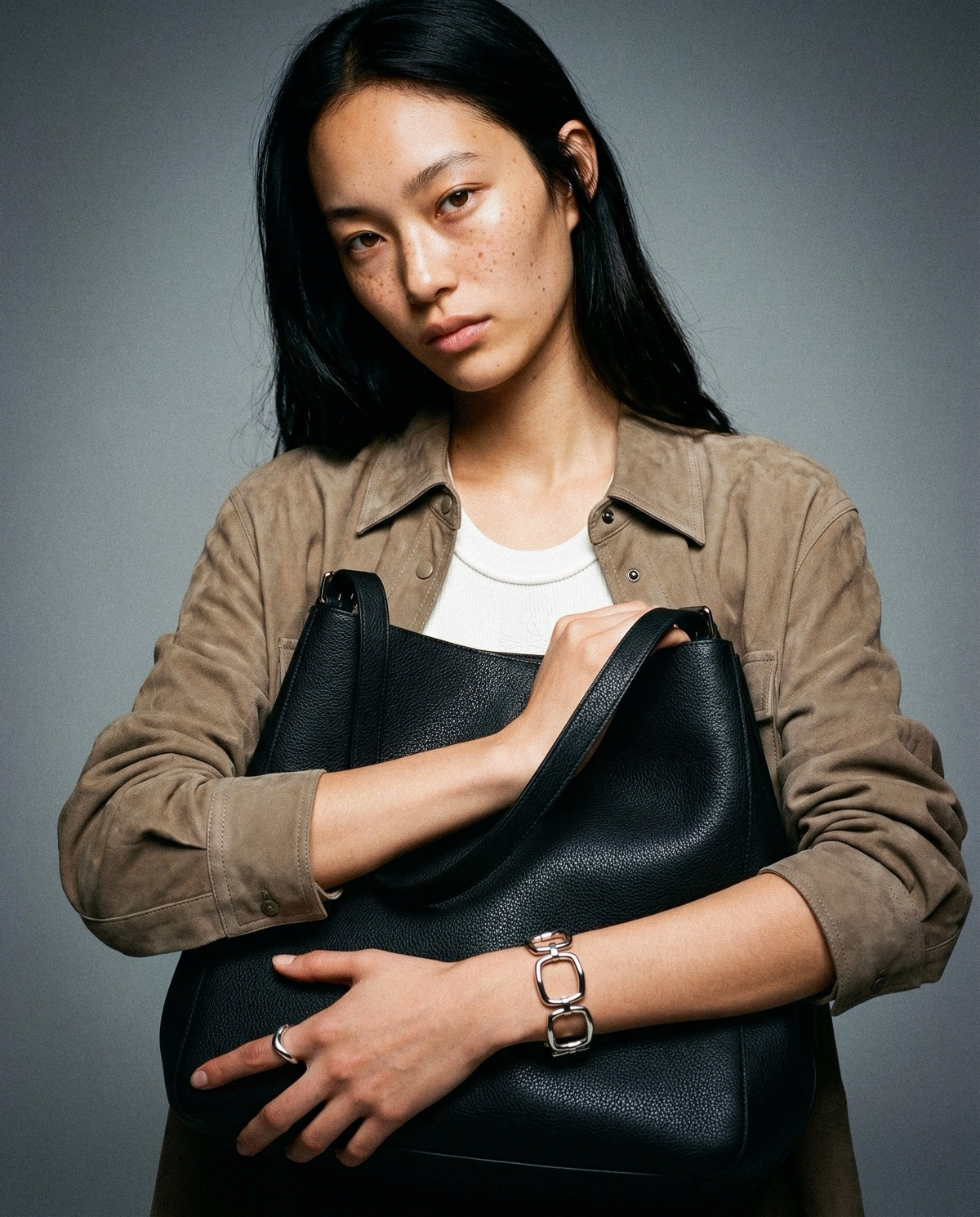


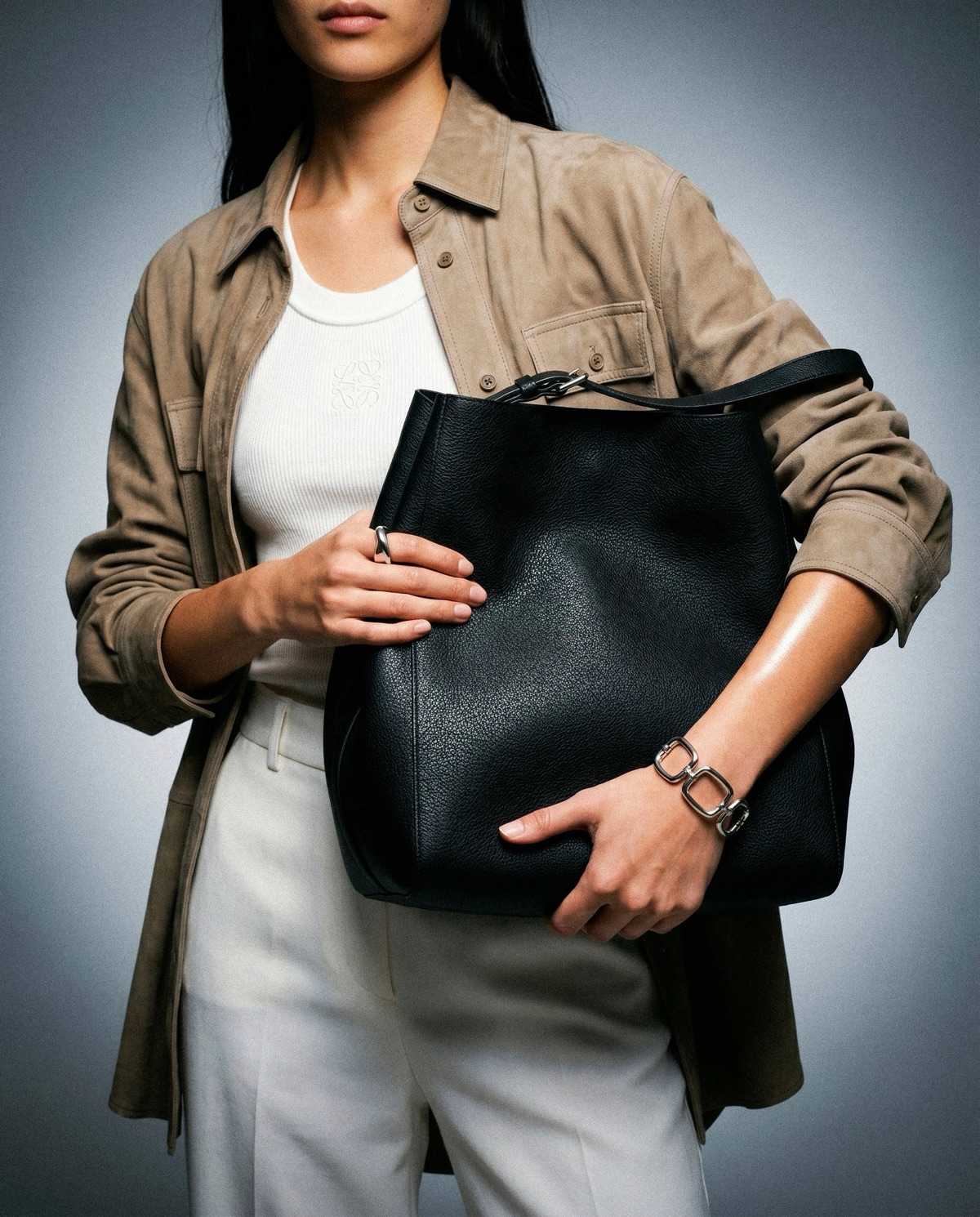

A complete visual identity for a single object
The output covers both ends of the production need. Clean product imagery ready for ecommerce, and editorial frames with enough character to carry a campaign. All from one consistent creative direction.
From one studio setup, a full set of assets built to perform across channels. Product page, campaign, social. The work travels because the logic behind it was clear from the start.




Ready to see what's possible?